
The Architecture of Books is a seminar taught by Reto Geiser at the Rice University School of Architecture. Students are introduced to the book as a means to think about the production of space, and as a critical vessel to discuss and disseminate architectural ideas.
Saturday, November 23, 2013
Thursday, November 21, 2013


Thursday, November 14, 2013
Dyslexie Typeface
Joseph's post about the Kickstarter campaign made me curious about typefaces designed for dyslexics. Dyslexie has a nice brief accompanying article.


Wednesday, November 13, 2013

Print AND Screen
In his essay "Paper vs. Pixel" Nicholas Carr offers an explanation why print and screen are complementing, rather than exclusive.


Sunday, November 10, 2013
Typography & Dyslexia
I stumbled upon this Kickstarter campaign for a book that aims to explore what it feels kike to have dyslexia:
Friday, November 8, 2013
Pantone online color challenge
How well do you see color? FACT: 1 out of 255 women and 1 out of 12 men have some form of color vision deficiency. Take the online color challenge, based on the Farnsworth Munsell 100 Hue Test.You can find the test here.


Sunday, November 3, 2013
Wednesday, October 30, 2013
books without pages, pages without books
This weekend! A new Rice Gallery-affiliated exhibition is opening on Saturday, called Books without pages, pages without books by the artist Jane Miller.

Saturday, November 2nd, 6:00 - 9:00 pm
G Gallery, 301 East 11th Street, 77008
Saturday, November 2nd, 6:00 - 9:00 pm
G Gallery, 301 East 11th Street, 77008
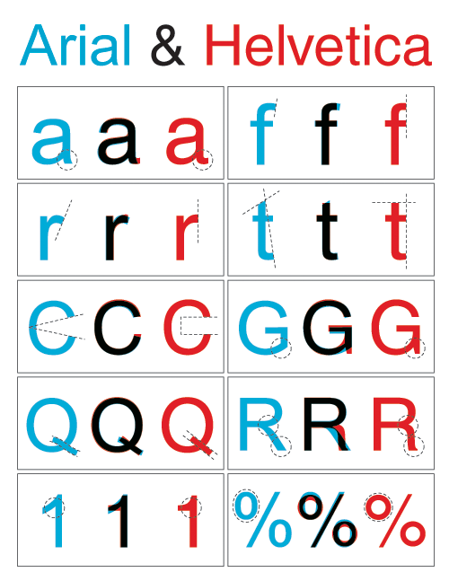
typography on the web
Those of us exploring books in digital format might be interested in some standards for typography on the web at webtypography.net. And what better way than to learn about it than through a website? The website experience alone is worth a look, it's attempting to be both an ebook and a website simultaneously—to seemingly mixed results. Its content on the limitations of type in the HTML / CSS formats is especially interesting, and makes me really appreciate a good old-fashioned word processor.
P.S. Speaking of web typography, there is no indication for links without hover on this blog. Personally I think it's a (WEB)TYPE CRIME! Having to spell it out to "click here" is very 1990's internet.
P.S. Speaking of web typography, there is no indication for links without hover on this blog. Personally I think it's a (WEB)TYPE CRIME! Having to spell it out to "click here" is very 1990's internet.
Monday, October 28, 2013

Tuesday, October 22, 2013
Trapped in the Loop
"Isn't life a series of images that change as they repeat themselves?" —Andy Warhol
This intriguing article argues that in our age of mass digital reproduction, "The Loop has become the preeminent narrative device of our time." However, the author also acknowledges that this claim inherently re-conceptualizes our understanding of narrative from a linear story to a circular event. As a text with no definitive beginning or end, but with a repeating and residue-filled middle, I would suggest that Junkspace fits into this discourse on the Loop as well.
As an aside, does anyone produce or consume Vines?
Monday, October 21, 2013
Antonio Negri writes a 3-pages essay on Rem Koolhaas
Last time we were in class, I posed the question of whether other fields read Junkspace, or if it was just architects. We determined that Frederic Jameson wrote about it, and here is another short-and-sweet essay by prominent contemporary philosopher, Antonio Negri (of Empire and Multitude fame). Enjoy!
http://www.haraldpeterstrom.com/content/5.pdfs/Antonio%20Negri%20%E2%80%93%20On%20Rem%20Koolhaas.pdf
http://www.haraldpeterstrom.com/content/5.pdfs/Antonio%20Negri%20%E2%80%93%20On%20Rem%20Koolhaas.pdf
Saturday, October 19, 2013
Friday, October 18, 2013
Mark Porter
A very interesting lecture by Mark Porter, the editorial designer of The Guardian. He touches on an array of topics that are all relevant to what we're doing.
Find the video here on It'sNiceThat.
Find the video here on It'sNiceThat.
Typographic Film Posters
We've discussed the difficulties of convincing publishers into accepting a typographic cover. I'm curious about the struggle that must take place for typographic film posters— a medium less wordy than books. The familiarity and pervasiveness of many of the following posters suggests that they can indeed capture general public interest.


The Sex and the City poster proves it can even be high or low brow.
There are dozens more examples of both classic and contemporary typographic posters.
The Sex and the City poster proves it can even be high or low brow.
There are dozens more examples of both classic and contemporary typographic posters.
Wednesday, October 16, 2013

Incidental Junkspace, or.. Mies rolls over in his grave

The resulting image echoes the nearby McCormick Tribune Campus Center, where an utter embrace of junkspace reigns...


Serpentine UK's New Graphic Identity
While i'm not a fan of Pentagram, their design for Serpentine's graphic identity demonstrates an interesting integration of digital media into their package. Read more here.
Tuesday, October 15, 2013
Monday, October 14, 2013
'Junkspace' substitutions
The built … product of Sustainability is not sustainable architecture but Green. Green is what remains after Sustainability has run its course or, more precisely, what coagulates while Sustainability is in progress, its fallout… (Taken from Rem Koolhaas text: Junkspace, and substituting: Modernity for Sustainability and Junkspace for Green, Beatriz Ramo, 2011).
Saturday, October 12, 2013
Saturday, October 5, 2013
A note on objects as projects
What characterizes the world of today more than
anything else is the expansion of the term design to encompass the rethinking
and recrafting of the whole fabric of life itself. Nothing is stable and taken
for granted anymore, objects are no longer matters of fact. They have attained
the higher status of projects, matters of concern for redesign.
This video looks at the ways in which interactive
design is transforming our engagement with objects. It talks about the creation
of an internet of things that respond to the ways in which we behave. A superorganism
of humans and objects is displacing the solitary figure of the man on top of the
food chain.
Friday, October 4, 2013
Google's tribute to Saul Bass
This past May, Google made this impeccable Doodle in homage to Saul Bass, which references many of his films. Enjoy!
Thursday, October 3, 2013
Ads for Typography
Galaxie Polaris Medium —
Tsvete

Didot Bold — Alex

Interstate Regular — Mahan

Trade Gothic Medium — Lizzie

Dolly Small Caps — Danny

FF Din Medium — Emily

Baskerville Italic — Michael

Futura Medium — Geoffrey

Didot Bold — Alex
Interstate Regular — Mahan
Trade Gothic Medium — Lizzie
Dolly Small Caps — Danny
FF Din Medium — Emily
Baskerville Italic — Michael
Futura Medium — Geoffrey
Print and Pixel
This essay by Nancy Levinson is posted at the Design Observer. It's relevance to our class was highly conspicuous as she discussed the publication Unpacking My Library: Architects and Their Books in conjunction with the a brief printing history, a discussion of the digital revolution and a hypothetical proposal for how to value a work in relation to current standards tied to commerce.

http://places.designobserver.com/feature/print-and-pixel-the-digital-future-of-publishing/38124/
http://places.designobserver.com/feature/print-and-pixel-the-digital-future-of-publishing/38124/
Book Design Studio at the University of Fine Arts in Warsaw
http://www.buszmeni.pl/ showcases the fantastic work of the graphic design students at the University of Fine Arts in Warsaw under Prof. Buszewicz. The beautifully curated website employs static images and short video sequences to capture the haptic qualities of a prolific collection of prints.

There are two things I forbid my students: to imitate children and to illustrate the words. A picture in a book must complement the words! One has to create what is not in the text. One must work against the grain of words. --Maciej Buszewicz

Tuesday, October 1, 2013
Monday, September 30, 2013
book as public thing (some fantastic covers)
Chicago/Urbana artist Conrad Bakker paints wooden blocks. On them, he re-creates vintage editions of books ranging in subject from continental philosophy to DIY culture. By gathering them into a collection and arranging them for display, the book-objects become a kind of distributed public space: platforms for discussion and tactile points of gravity for an otherwise dispersed collective.

In some iterations of the project, the objects occupied a bookstore; in another, they act as an installation in a gallery. Most interesting, though, is when they attempt to circulate within contemporary market networks using eBay as a platform.


In some iterations of the project, the objects occupied a bookstore; in another, they act as an installation in a gallery. Most interesting, though, is when they attempt to circulate within contemporary market networks using eBay as a platform.

Sunday, September 29, 2013
Futura

It was interesting to discover the use of Futura in many works that I knew very well. The font really accentuates a forward looking attitude with its simple geometric forms and near even stroke weights.

Print advertisement for Volkswagen. Copy by Julian Koenig, art direction by Helmut Krone, Doyle Dane Bernbach, 1959

Kubric. 2001: A Space Odyssey, 1968.

The commemorative plaque left on the Moon in July 1969.

Wes Anderson. The Royal Tenenbaums, 2001.
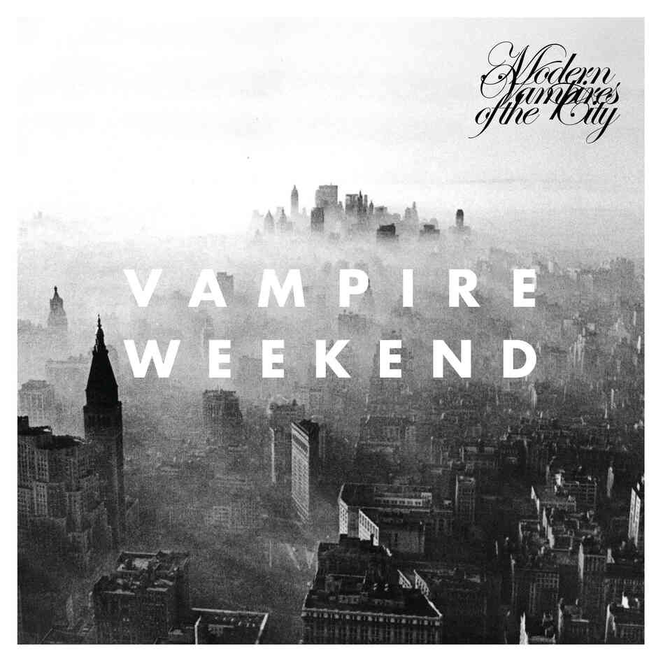
Vampire Weekend. Modern Vampires of the City, 2013. The font is also used in this video from the album. http://www.youtube.com/watch?v=_mDxcDjg9P4
Saturday, September 28, 2013
Typography in Science Fiction
Tsvete's futuristic typeface from the last assignment on typography got me thinking about typography in Science Fiction. It seems like a common marketing approach to use a unique typeface for the sake of branding, as seen in big Sci-Fi franchises like Star Wars or Star Trek.
What exactly makes a typeface look space age?
Linearity?
Beveled corners?
Slanted axes on characters?
Uber spacious kerning?
Disintegrating, acid-oozing letters?
A new publication, "Science Fiction Typography," examines this question through compiling header text on popular science fiction magazines from the 1930s - 1970s.
Subscribe to:
Comments (Atom)