
The Architecture of Books is a seminar taught by Reto Geiser at the Rice University School of Architecture. Students are introduced to the book as a means to think about the production of space, and as a critical vessel to discuss and disseminate architectural ideas.
Monday, September 30, 2013
book as public thing (some fantastic covers)
Chicago/Urbana artist Conrad Bakker paints wooden blocks. On them, he re-creates vintage editions of books ranging in subject from continental philosophy to DIY culture. By gathering them into a collection and arranging them for display, the book-objects become a kind of distributed public space: platforms for discussion and tactile points of gravity for an otherwise dispersed collective.

In some iterations of the project, the objects occupied a bookstore; in another, they act as an installation in a gallery. Most interesting, though, is when they attempt to circulate within contemporary market networks using eBay as a platform.


In some iterations of the project, the objects occupied a bookstore; in another, they act as an installation in a gallery. Most interesting, though, is when they attempt to circulate within contemporary market networks using eBay as a platform.

Sunday, September 29, 2013
Futura

It was interesting to discover the use of Futura in many works that I knew very well. The font really accentuates a forward looking attitude with its simple geometric forms and near even stroke weights.

Print advertisement for Volkswagen. Copy by Julian Koenig, art direction by Helmut Krone, Doyle Dane Bernbach, 1959

Kubric. 2001: A Space Odyssey, 1968.

The commemorative plaque left on the Moon in July 1969.

Wes Anderson. The Royal Tenenbaums, 2001.
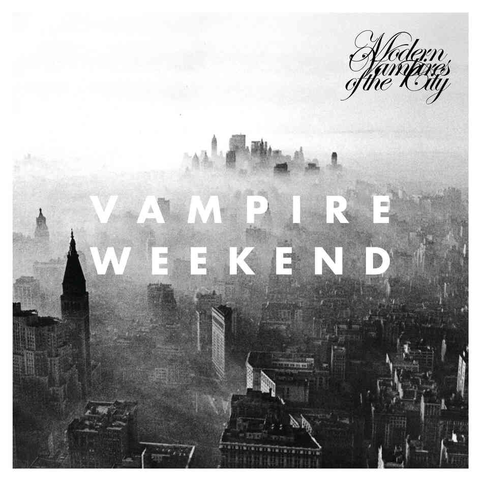
Vampire Weekend. Modern Vampires of the City, 2013. The font is also used in this video from the album. http://www.youtube.com/watch?v=_mDxcDjg9P4
Saturday, September 28, 2013
Typography in Science Fiction
Tsvete's futuristic typeface from the last assignment on typography got me thinking about typography in Science Fiction. It seems like a common marketing approach to use a unique typeface for the sake of branding, as seen in big Sci-Fi franchises like Star Wars or Star Trek.
What exactly makes a typeface look space age?
Linearity?
Beveled corners?
Slanted axes on characters?
Uber spacious kerning?
Disintegrating, acid-oozing letters?
A new publication, "Science Fiction Typography," examines this question through compiling header text on popular science fiction magazines from the 1930s - 1970s.
Thursday, September 26, 2013
On the impact of big images
We all appreciate books that indulge us with large image reproductions. The visual attains a different status once it bleeds out of the boundary of the page. Interactive design often takes advantage of this fact, as shown by Drexel University's recent campaign Get Going Today and the New York Times's project reporting on the avalanche at Tunnel Creek. Both of these works rely heavily on the impact of large-size video sequences to deliver a clear and succinct message.
Wednesday, September 25, 2013
Alice Rawsthorn of the New York Times explains some of the obstacles every typedesigner grapples with, when it comes to digital typography.
Subscribe to:
Posts (Atom)