
The Architecture of Books is a seminar taught by Reto Geiser at the Rice University School of Architecture. Students are introduced to the book as a means to think about the production of space, and as a critical vessel to discuss and disseminate architectural ideas.
Monday, September 30, 2013
book as public thing (some fantastic covers)
Chicago/Urbana artist Conrad Bakker paints wooden blocks. On them, he re-creates vintage editions of books ranging in subject from continental philosophy to DIY culture. By gathering them into a collection and arranging them for display, the book-objects become a kind of distributed public space: platforms for discussion and tactile points of gravity for an otherwise dispersed collective.

In some iterations of the project, the objects occupied a bookstore; in another, they act as an installation in a gallery. Most interesting, though, is when they attempt to circulate within contemporary market networks using eBay as a platform.


In some iterations of the project, the objects occupied a bookstore; in another, they act as an installation in a gallery. Most interesting, though, is when they attempt to circulate within contemporary market networks using eBay as a platform.

Sunday, September 29, 2013
Futura

It was interesting to discover the use of Futura in many works that I knew very well. The font really accentuates a forward looking attitude with its simple geometric forms and near even stroke weights.

Print advertisement for Volkswagen. Copy by Julian Koenig, art direction by Helmut Krone, Doyle Dane Bernbach, 1959

Kubric. 2001: A Space Odyssey, 1968.

The commemorative plaque left on the Moon in July 1969.

Wes Anderson. The Royal Tenenbaums, 2001.
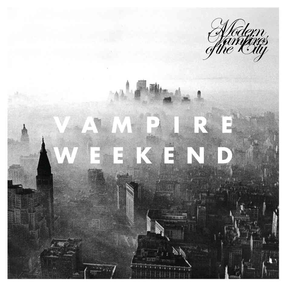
Vampire Weekend. Modern Vampires of the City, 2013. The font is also used in this video from the album. http://www.youtube.com/watch?v=_mDxcDjg9P4
Saturday, September 28, 2013
Typography in Science Fiction
Tsvete's futuristic typeface from the last assignment on typography got me thinking about typography in Science Fiction. It seems like a common marketing approach to use a unique typeface for the sake of branding, as seen in big Sci-Fi franchises like Star Wars or Star Trek.
What exactly makes a typeface look space age?
Linearity?
Beveled corners?
Slanted axes on characters?
Uber spacious kerning?
Disintegrating, acid-oozing letters?
A new publication, "Science Fiction Typography," examines this question through compiling header text on popular science fiction magazines from the 1930s - 1970s.
Thursday, September 26, 2013
On the impact of big images
We all appreciate books that indulge us with large image reproductions. The visual attains a different status once it bleeds out of the boundary of the page. Interactive design often takes advantage of this fact, as shown by Drexel University's recent campaign Get Going Today and the New York Times's project reporting on the avalanche at Tunnel Creek. Both of these works rely heavily on the impact of large-size video sequences to deliver a clear and succinct message.
Wednesday, September 25, 2013
Alice Rawsthorn of the New York Times explains some of the obstacles every typedesigner grapples with, when it comes to digital typography.
Tuesday, September 24, 2013
Chip Kidd (Book Designer) Ted Talk
http://www.ted.com/talks/chip_kidd_designing_books_is_no_laughing_matter_ok_it_is.html
This is the TED Talk given by Chip Kidd, a well-known book designer of such books as Jurassic Park and 1Q84, speaking on the relationship between a book's content and its cover design.
This is the TED Talk given by Chip Kidd, a well-known book designer of such books as Jurassic Park and 1Q84, speaking on the relationship between a book's content and its cover design.
Sunday, September 22, 2013
GIF Art
For those of us in the digital group, the GIF presents a new and difficult artistic medium. Most of us see GIFs often, but they are usually in the form of annoying Web advertisements whose movement is purely a tool to divert the observer's eye from what they are actually trying to read or watch. I was totally lost about how to make a good GIF before last Thursday's class, but seeing other people's ideas helped me a lot. In the same spirit, here is a website to browse called GIF Art. A lot of the GIFs are too noisy and obnoxious, but I think some are pretty interesting as well. Take a look!
http://www.gifart.org/
http://www.gifart.org/
a nice thing some of us are missing
i hope you totalization students get some time away from consultants to go enjoy some printed matter at the new york art book fair...
The thing I've always liked about print culture is its physical nature, and its dependence on the act of dissemination or distribution. You need to go to the thing, or the thing has to come to you. Book fairs and comics expos are one of the best ways to examine a city's graphic tradition and pick up on the effect graphic practices have on the formation of communities and their positioning in relation to the local art world.


The thing I've always liked about print culture is its physical nature, and its dependence on the act of dissemination or distribution. You need to go to the thing, or the thing has to come to you. Book fairs and comics expos are one of the best ways to examine a city's graphic tradition and pick up on the effect graphic practices have on the formation of communities and their positioning in relation to the local art world.


Saturday, September 21, 2013

Thursday, September 19, 2013
What's your type?
The confident folks at Pentagram think they have you all figured out. Try out their interactive typographic psychoanalysis. They'll take careful notes on your responses! They apparently think that I am Herbert Bayer's universal. They are wrong, but I do have a deep affinity for Mr. Bayer. That probably threw them off...
So tell me, what type are you?
So tell me, what type are you?
Tuesday, September 17, 2013
Hydrogen or Helvetica?
At the current show at the Contemporary Arts Museum of Houston, "GRAPHIC DESIGN—NOW IN PRODUCTION," there is a brief display on the use of typefaces in branding, much like our discussion in class.

What typefaces are commonly used in branding? The following "Periodic Table of Typefaces" attempts to rank such use in marketing, along with use in a broader professional setting. According to the designer, the number rankings are based on compiling various "best of" lists from around the internet... sources on the bottom of the graphic.
[Click here to enlarge image]
Monday, September 16, 2013
literacy for millennials
It's hard to watch this and deny that print media's well on its way to obsolescence...
Friday, September 13, 2013
Animating the print


German magazine DEAF augments reality to facilitate communication between people who use sign language. Along its graphic merits as a print on its own, the magazine compacts video and audio information, allowing its audience to bridge the gap between German sign and spoken and written languages.
Source: Behance
Thursday, September 12, 2013
Digital Pages
For years one of the most fascinating thing about a book is that you can flip it through and feel the pages with your finger. Without reading it you can already feel its texture, so in a way your senses "read" the book before your mind does. Question is, as a vehicle of information, what can be changed if pages are no longer made of paper? This could lead to many interesting paths and arguably the dramatic change of our understanding of books.
IDEO on the future of books, three years ago
Three years ago, IDEO introduced Nelson, Coupland and Alice, different types of digital reading experiences. Nelson cross-references everything, Coupland helps you filter information based on your interests and networks, and Alice allows you to change the narrative of the book you`re reading. Quickly looking at the responses on YouTube, reactions seem to be consistent over the years. Some people are excited, but it seems like more are annoyed and not interested in being overly stimulated: ``can`t people just read books,`` ``go to the library.`` A few aspects of the three characters seem to have integrated the world of digital reading, such Nelson`s ability to connect sources. With the common use of smart technology being relatively recent, are we still adapting to a different pace of exposure to information, and what seems like extreme interactivity might eventually become normal?
Wednesday, September 11, 2013
Apple's Affair
The entire story of Apple's Case is setting a historical legal framework for the future of e-books; worth following older links in the article.
 |
| Monica M. Davey/European Pressphoto Agency, from NYTimes |

Tuesday, September 10, 2013
A few [side] notes of interest
/// "It is customary for the sides of a page to be neglected in favor of its front and back." --John Maeda
/// Irma Boom on the design of Weaving as a Metaphor: https://vimeo.com/703587


/// Irma Boom on the design of Weaving as a Metaphor: https://vimeo.com/703587


Limits of Recycling: A Parable of Book Construction
In a recent article, The Telegraph reported the enormous surplus of copies for Fifty Shades of Grey now being donated to charity shops in droves as the "hype" of the once coveted novel dies down. According to their sources, for every one that is sold, two more are received. Any judgement of the book's content notwithstanding, the persisting problem is that the books cannot be recycled because of the glue that was used for their assembly.
Towards a conversation about the lifecycle of the books half of the class will be designing and assembling at the end of the semester, I propose a question: what glues are "environmentally friendly"?
Source:
http://www.telegraph.co.uk/culture/books/10289912/Charity-shops-stuck-with-thousands-of-copies-of-50-Shades-of-Grey.html
No More Reading!
 |
| Snapshot of Archinect's posting about Rice Lecture Series, Fall 2013 |
A side-note: El Lissitzky, an eminent member of the group ASNOVA, an early 20th century Soviet avant-garde group that are commonly called 'The Rationalists', once articulated his approach to book design as such: "Nicht mehr Lesen! Sehen!" (No more reading! Seeing!).
Monday, September 9, 2013
apple ends long-term relationship with object metaphors
a little food for thought / for more information check out this article - "Beyond The Shadows: Apple's iOS 7 Is All About the Screen" from NPR's All Tech Considered...
The metaphor as a tool for universal accessibility has a long standing tradition in the digital world. This is because of its ability to instantaneously translate function by forming visual relationships to the physical world. However, Apple’s new operating system will soon eliminate the visual metaphor within the iPhone and iPad user interface, instead relying on intuition and our growing proficiencies in “the world of the screen.” How does the elimination of the metaphor within the digital device create new opportunities for expression and innovation, and how does this approach affect accessibility?
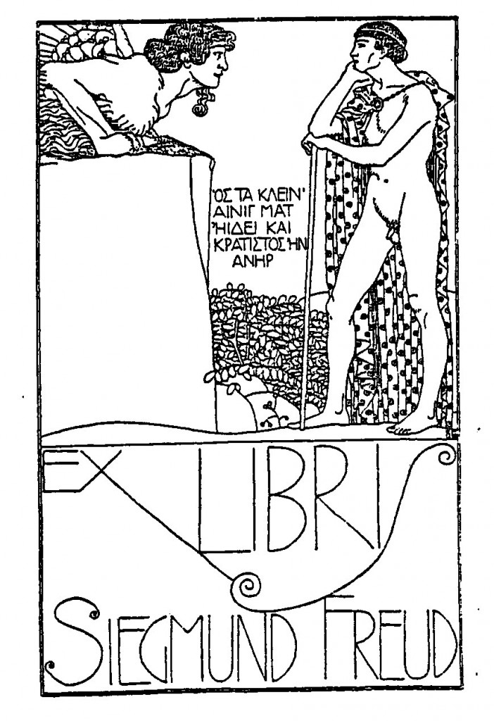
Ex Libris
In "What Is an Author?" (1969), Michel Foucault noted that ever since authors could be held responsible for what they write, their text has been viewed as a kind of private property. Consequently, the author, as owner of their text, leaves little room for the reader to develop their own interpretation. What then, can we do as readers to lay claim to our books? What should the designer as owner do?
Don't let Foucault fool you... it's easy: design your own book plate!
Book plates have been in use since as early as the 1450's so there is a convention or two to follow. Brush up on your Latin and dust off your family crest. Or a family motto will do. A variety of subject matters are appropriate, but some are more appropriate than others, such as: dragons, mythical creatures, dogs, musical instruments, trophies, landscapes, angels, children, naked women, or—books.
Another Edition of Project Japan

Obi is commonly seen in Japanese publications usually for advertising the book. On the pink band is the comment of the interviewer (the advertising part), while on the orange band is a summary of the book content which is similar to the description of the English version but from a more local point of view.
It's interesting to see that on Heibonsha's website, the book comes without the obi, while on Taschen's website it's shown with the two bands. It reveals the fact that obi is not usually considered as part of the book. Besides, Obi wraps around the book while the two vertical bands only wraps around the front cover.

Heibonsha(2012/2/25)/ Taschen (2011/10/28)
Sunday, September 8, 2013
Your House
In one of the rare times that I'll promote the proliferation of eye candy: here are some photographs of Eliasson's Your House, designed by Michael Heimann and Claudia Baulesch. It's better in the flesh (as with most print matter), but you can imagine the desired effect looking at these images: moving through a dense compilation of sectional cuts taken through the artist's own house, allowing the effect of the binding to play with the angle of projection. Eliasson also exploits the double axis of time and space that Mau discusses in "Reading: Shaping Time"as a territory belonging to type, and, by extension, books.


Thursday, September 5, 2013
Bookmaking eye candy for your Thursday morning
The birth of a book: a short vignette of a book being created using traditional printing methods. Enjoy!
Subscribe to:
Comments (Atom)